Co-Founder · Product Manager · Product Designer
TechTavernLabs
Brand Identity & Website: B2B Digital Agency
Brand strategy · Visual identity · Web design · Frontend development · React · Next.js
Visit TechTavernLabs ↗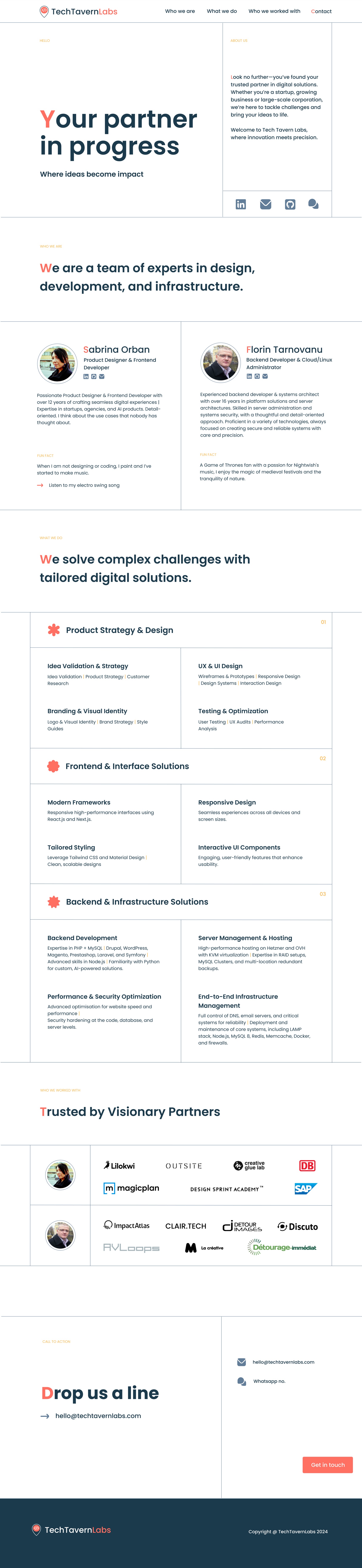
Overview
TechTavernLabs was a joint venture I co-founded with a backend engineer and cloud specialist. Together we covered the full stack of digital product delivery: product strategy, design, frontend, backend, and infrastructure. The first thing we needed was a presence that made that breadth credible without feeling scattered.
The brief I set for myself: build something that reads as premium and focused in under a minute, with no room for ambiguity about who we are and what we do.
I designed and coded the entire website by hand, no AI generation, in Next.js and Tailwind CSS. Fully responsive across mobile, tablet, and desktop.
Client Work
Our key client project was Clair.Health, a data-driven patient health platform built to support multiple health programs. I improved the overall platform UX and designed the first program, a women's health initiative, to fit within it. Work covered brand strategy, public website, internal platform UI, design system, and medical program integration (Life 360 / Anau). End-to-end, from brand positioning through to scalable component architecture.
How I got to this design
ONE STRONG IDEA: With a two-person team and no time to over-design, I committed to a single visual signature and executed it cleanly: the first letter of every key headline in orange. It creates a rhythm across the page that feels intentional and distinctive without relying on complex layouts or illustration.
COLOUR: The orange is assertive but not loud, warm enough to signal approachability, sharp enough to signal precision. Against a clean white background with black body text, it does all the personality work so the rest of the design can stay neutral and professional.
STRUCTURE: The services are split into three clear pillars (Product Strategy & Design, Frontend & Interface Solutions, Backend & Infrastructure Solutions) mirroring exactly how we were structured as a team. A potential client can immediately map their need to a person.
SOCIAL PROOF: We both had strong client histories independently. I pulled those together into a logo wall that gave the studio instant credibility (magicplan, Deutsche Bahn, SAP, Outsite, Lilokwi) before a client even reached the services section.
COPY: "Your partner in progress" is doing more than sounding good. It positions TechTavernLabs as a collaborator, not a vendor, which is exactly how we worked with clients. "Where ideas become impact" closes the thought without overselling.