UX/UI Designer
magicplan
AR Floor Plan App: Apple Enterprise Partnership
AR UX redesign · User research (14 recruited participants) · ARKit · Interaction design · Apple HIG · Haptics · AI-powered auto-detection
Visit magicplan ↗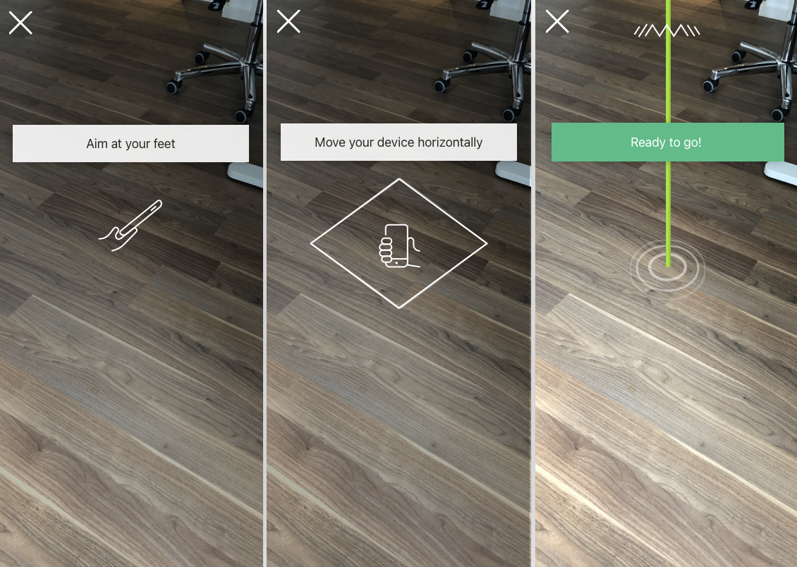
Overview
magicplan is a floor plan creation app that turns built spaces into data with just your phone. When I joined, the AR Capture feature was powerful but intimidating: users were struggling to even get started, and many gave up before finishing a room scan.
My job was to redesign the experience so that anyone, from real estate agents to DIY users, could scan a room quickly and confidently. As part of the Apple Enterprise Partnership, every design went through review sessions with the Apple team, keeping us closely aligned with their Human Interface Guidelines and pushing me to elevate quality with every iteration.
The Challenge
The technology worked, but the experience didn't.
Users were failing right at the ARKit initialization step because the instructions weren't clear. Once inside Capture, warnings and tutorials went unnoticed, 2D UI elements clashed with the 3D world, and the flow was crammed with too many actions at once. It was frustrating to watch people get stuck before they could even see the value of the app.
Process
Getting real user feedback was tough: Facebook groups didn't bite, flyers didn't work, and people weren't showing up. After weeks of trial and error, we finally brought in 14 target users through a recruitment agency.
Watching them test the app was eye-opening: they missed critical steps, got confused by the interface, and often abandoned scans halfway. From there, I mapped every pain point and started iterating: multiple versions, competitor research, internal and live sessions, and feedback from both users and the Apple design team.
The Solution
I redesigned AR Capture around three principles: clarity, focus, and guidance.
CLARITY: Fixed ARKit initialization with animated visuals, friendlier wording ("point at"), and haptic feedback to confirm success.
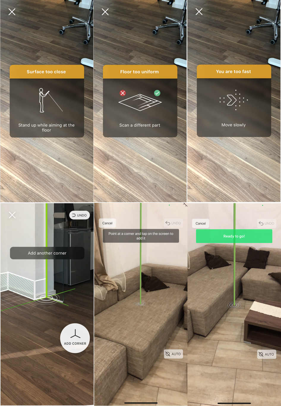
FOCUS: Split the flow into three simple steps: corners → height → doors/windows. Added AI-powered auto-detection for tricky cases like occlusions.
GUIDANCE: Replaced cryptic toast messages with persistent overlays, simple illustrations, and one clear instruction at a time.
CONSISTENCY: Unified 2D and 3D UI, repositioned buttons for ergonomic reach, and replaced some buttons with simple tap gestures for a more natural feel.
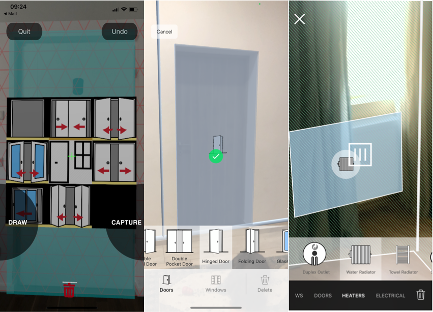
MENUS: Rebuilt object selection, inspired by Instagram/Snapchat sliders, to make it faster and more intuitive without blocking the AR view.
Impact
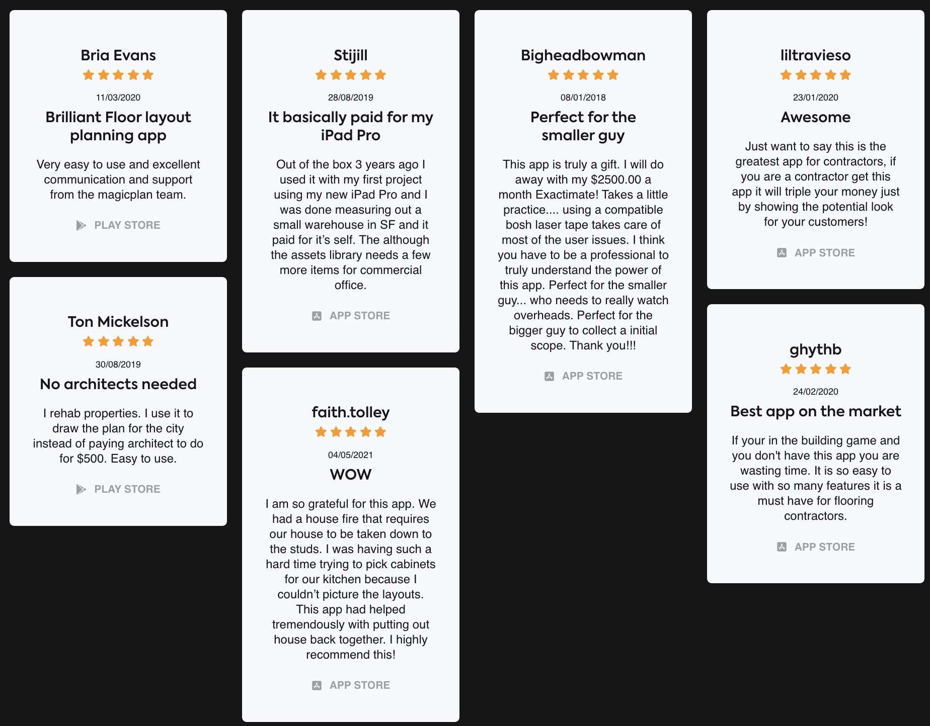
The redesign drastically improved success rates for AR initialization and room completion. App Store and Google Play reviews reflected the change, and the feature became a key driver in helping magicplan grow to over 20 million downloads.
Reflection
This project reminded me that the hardest part isn't always the technology. It's making the experience feel natural. By fighting for real user testing, pushing through multiple iterations, and working under Apple's design review process, we transformed AR Capture from something intimidating into something almost magical.
All designs went through iterative reviews with Apple's design team, ensuring our solutions not only solved user problems but also met Apple's standard for intuitive AR interactions.